How to access your performance trends report
The Performance Trends report takes merchandising, price badging, connections, VDPs, SRPs, inventory and reputation, and turns these data points into trend charts for a quick glance at the metrics over time. At a high level, it shows you a 13-month look at your dealership’s overall performance on Cars.com.
To get started
Go to the Cars.com Hub.
1 Find your reporting in the Hub
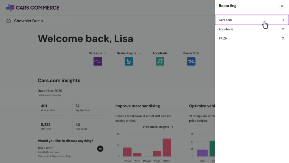
Once logged into the Hub, click Reporting, then Cars.com.
2 Select Inventory & Merchandising
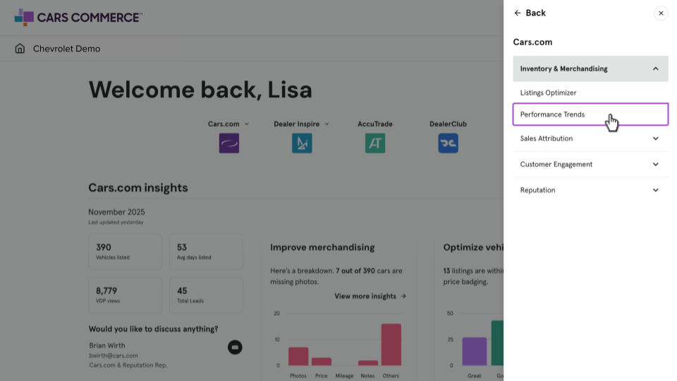
Click Inventory & Merchandising, then the Performance Trends report from the dropdown.
3 Using the “Main Report” tab
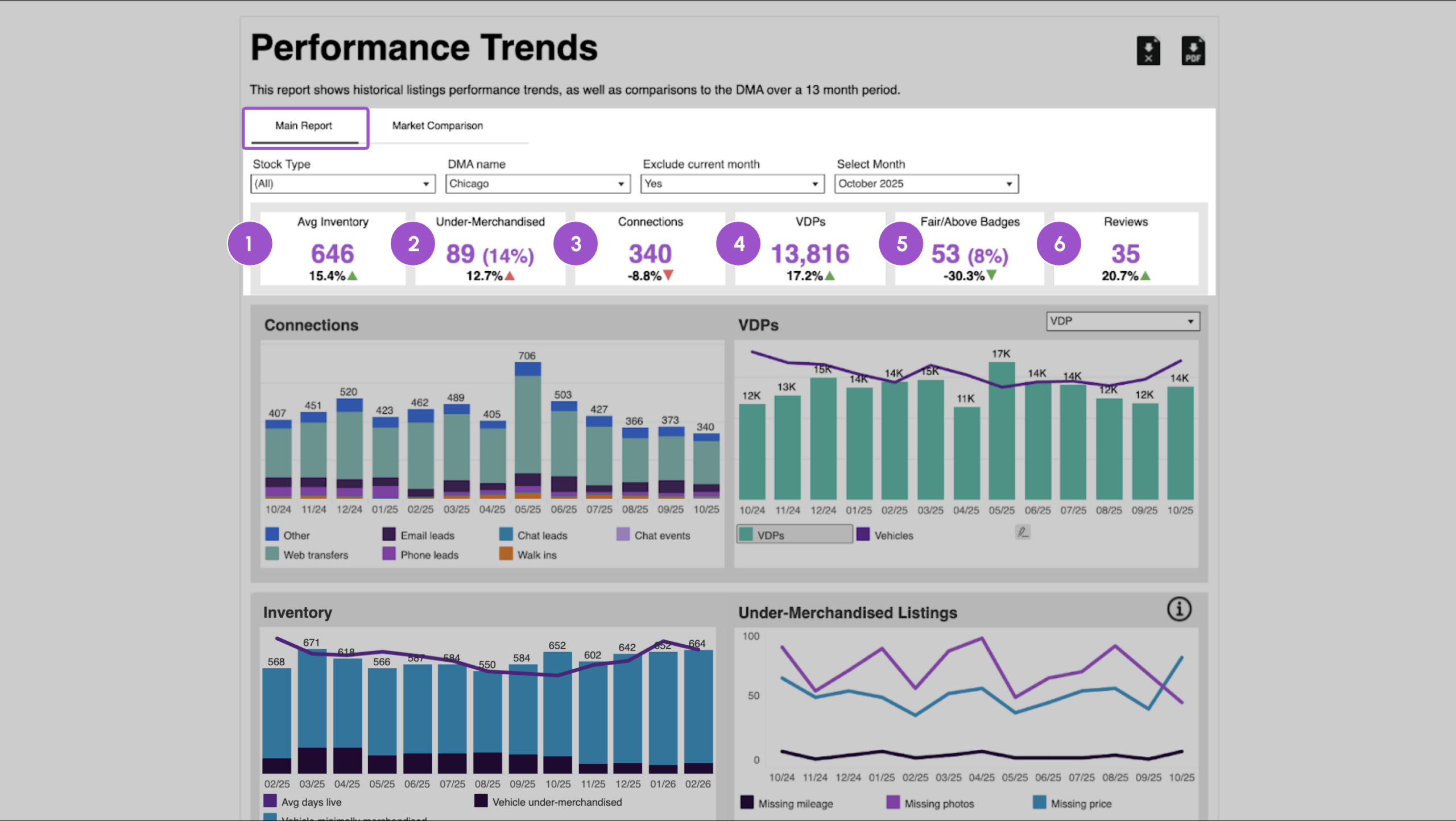
Use the filters at the top of the report to refine your view:
- Stock Type
- DMA Name
- Exclude Current Month (useful when the current month is partial)
- Select Month
The snapshot summary adjusts based on the Select Month filter and defaults to the last full month.
The percentages shown beneath each metric, indicated by green or red triangles, represent the month-over-month change.
Snapshot metrics include:
- Avg Inventory: total number of vehicles listed per month
- Under-Merchandised: number of vehicles that had incomplete merchandising per month (i.e. missing photos, sellers notes, mileage.)
- Connections: total connections the dealer has received
- VDPs: total number of VDPs the dealer has received
- Fair/Above Badges: used vehicles that have a fair or above market average price badge
- Reviews: total number of reviews received within the month
Connections
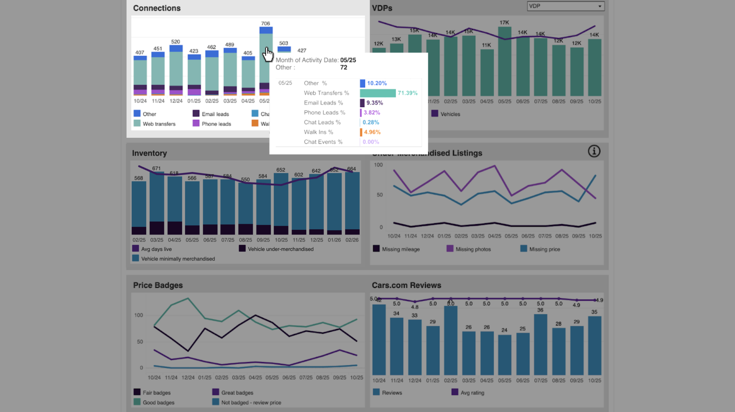
This bar graph represents all the connections that were received each month. Each color is a different connection type (phone calls, email leads, or website transfers). Hover over the bar chart to get a quick breakdown of data for that month.
VDPs or SRPs
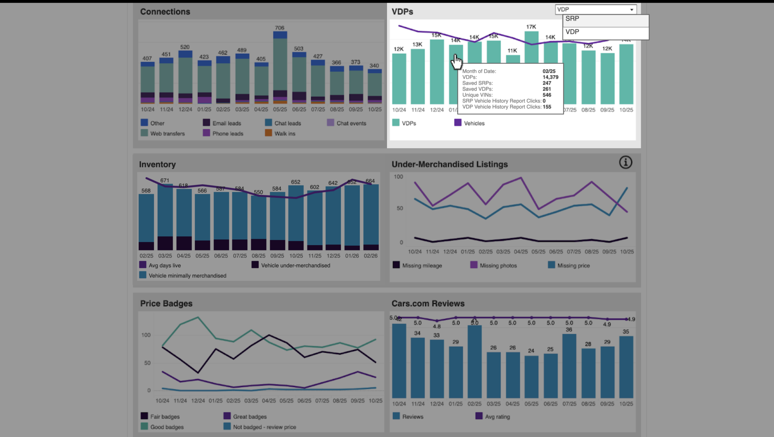
Use the toggle in the top-right corner of the chart to switch between VDPs and SRPs.
- The bar chart shows total SRPs or VDPs per month.
- The line graph represents:
- SRP view: Click-through rate from SRP to VDP
- VDP view: Total number of vehicles in inventory per month
- SRP view: Click-through rate from SRP to VDP
When viewing VDPs, hover over the chart to see additional metrics such as Saved Vehicles and Vehicle History Report clicks.
Inventory
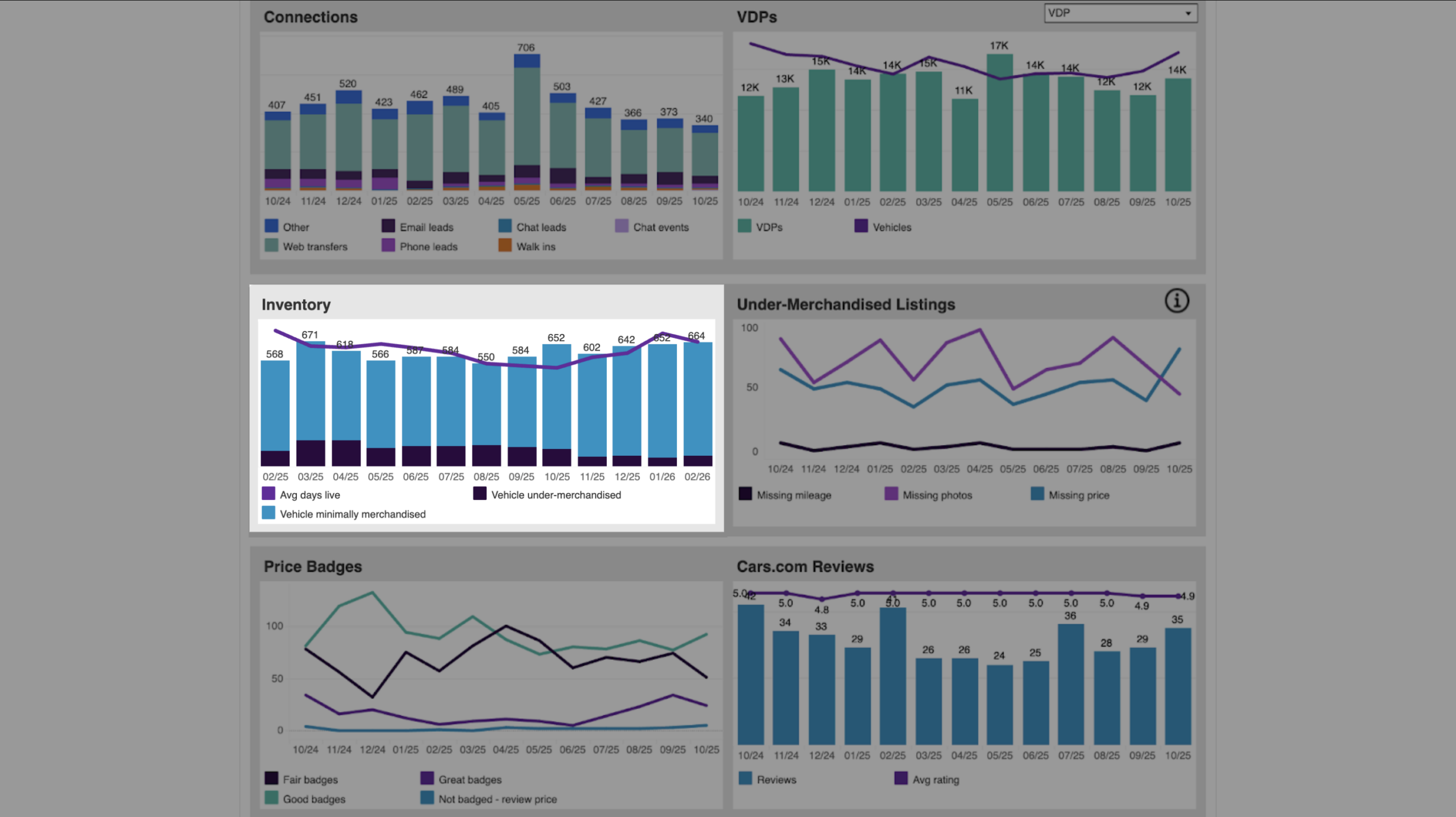
This bar graph indicates the total number of unique VINs listed on site during each month: highlighting all vehicles that are completely merchandised as well as incomplete vehicles.
The line graph represents the average days of live inventory by month to indicate a trend of turn rate. Hover over any component on the chart to get exact number values for each category.
Under-Merchandised Listings
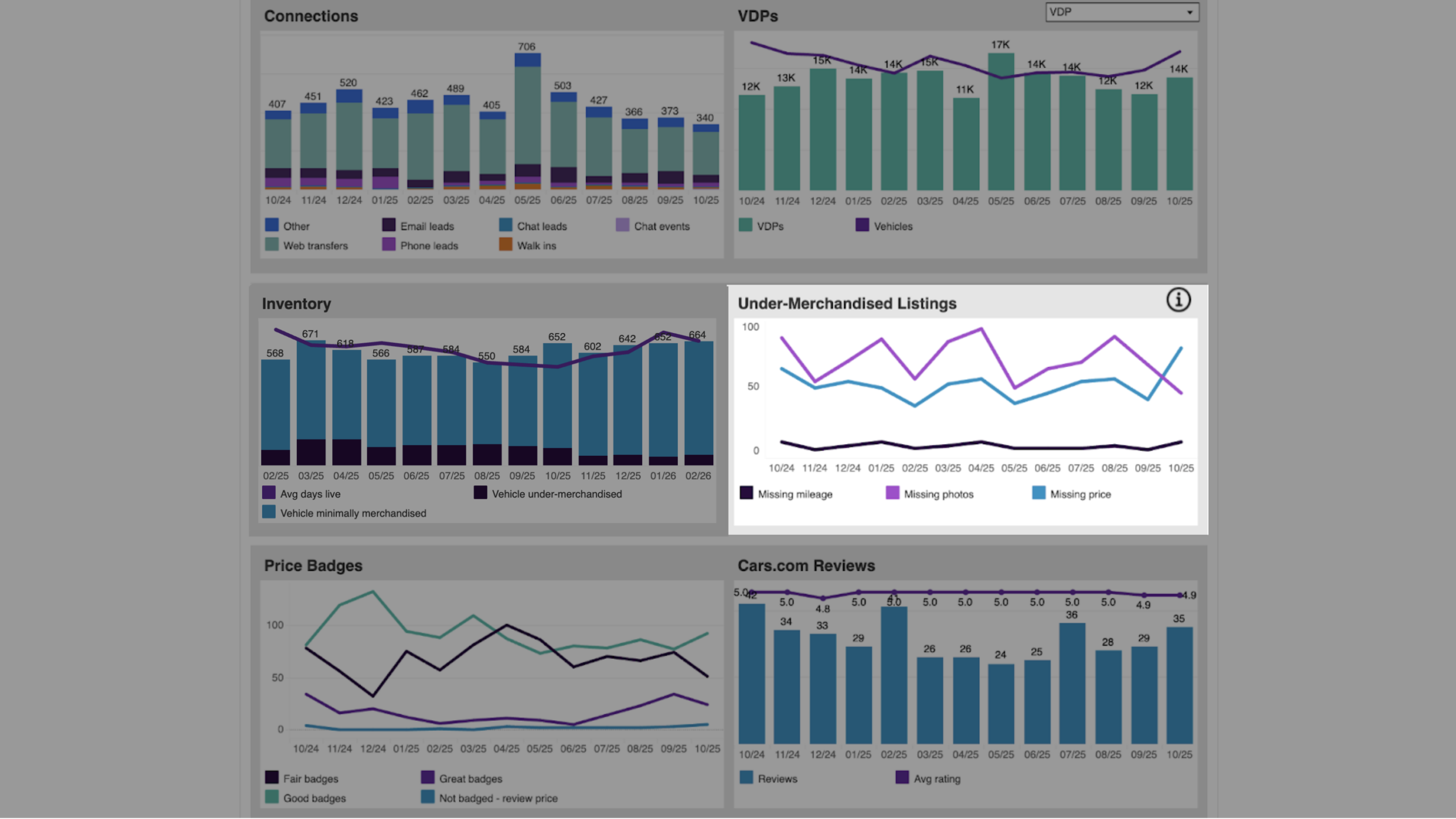
The colored line chart shows the trend of missing merchandising over time. You can see if merchandising has improved or declined in a certain area, which may relate to other performance indicators on this report. Hover over any component on the chart to get exact number values for each category.
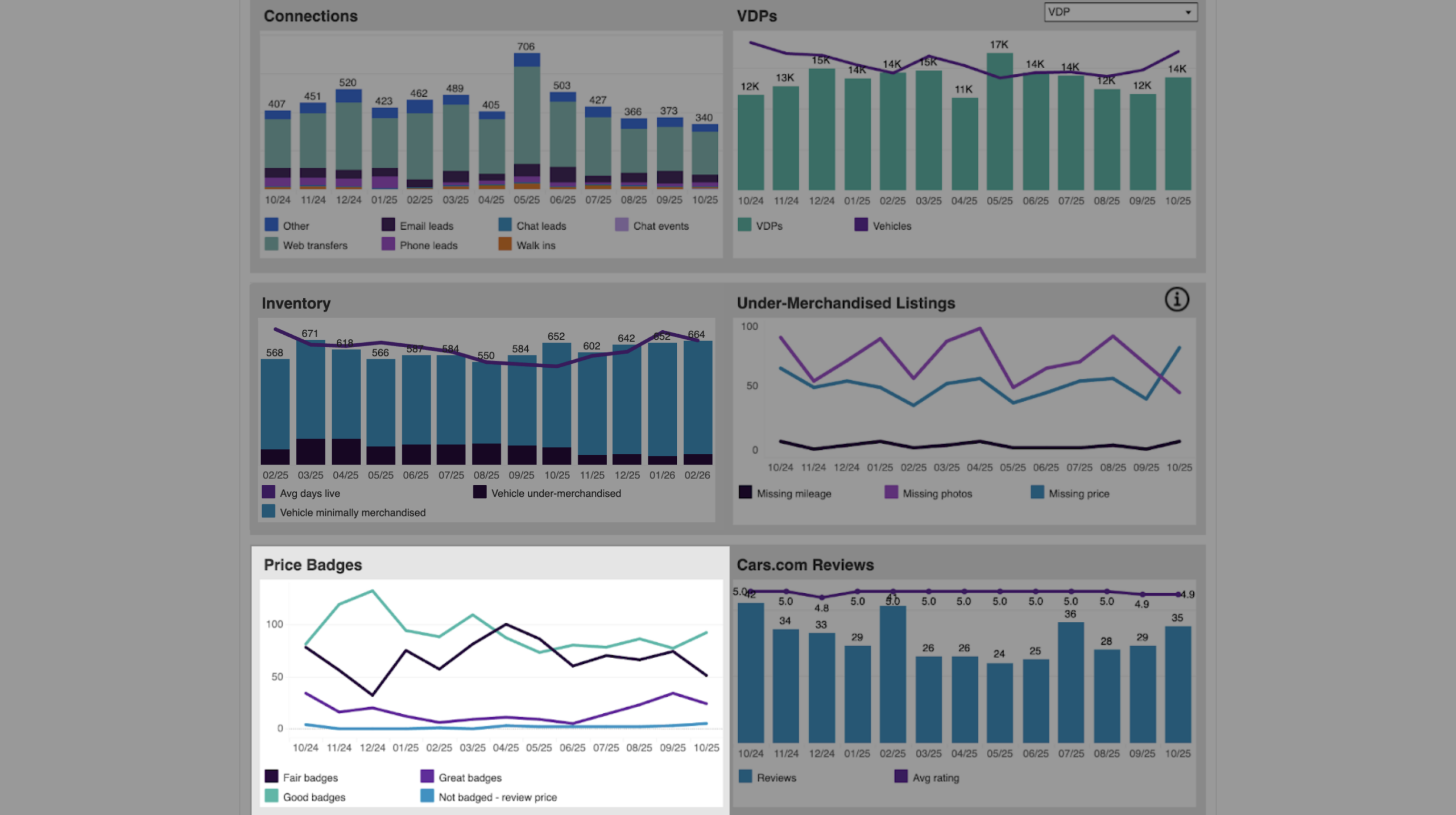
Price Badges
This line chart represents the number of badges within a particular category per month. Price Badges help you understand the trend of your pricing versus other vehicles in the market.
Hover over any component on the chart to get exact number values for each category.
Note: Vehicles marked as Not Badged do not display a price badge to shoppers on Cars.com.
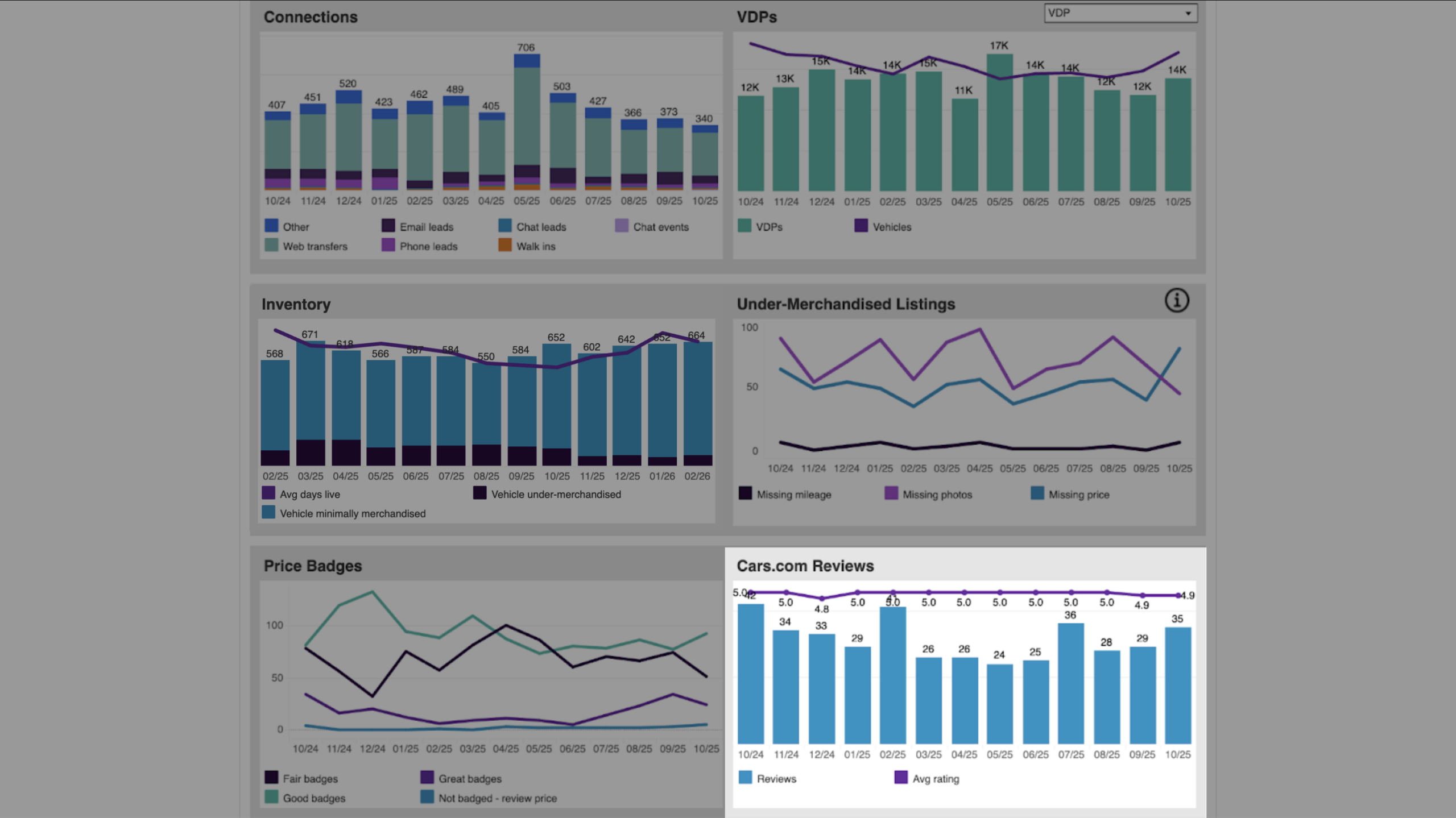
Cars.com Reviews
This bar graph is a summary of the number of reviews that you get on Cars.com, while the line graph above it indicates your average rating per month across those reviews.
4 Click into the “Market Comparison” tab
Click the Market Comparison tab to evaluate your dealership’s results against others in your market. This market-level information provides critical benchmark data you can use to assess your performance.
Available filters include:
- DMA Name
- Stock Type
- Exclude Current Month
- Select Month
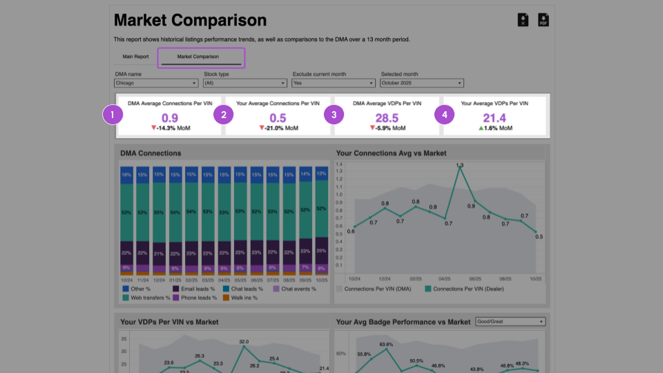
Top-level metrics include:
- DMA Average Connections Per VIN: number of connections per VIN at the DMA level. The comparison below shows what the % change is from the previous month.
- Your Average Connections Per VIN: number of connections per VIN at the dealer level. The comparison below shows what the % change is from the previous month.
- DMA Average VDPs Per VIN: number of VDPs per VIN at the DMA level. The comparison below shows what the % change is from the previous month.
- Your Average VDPs Per VIN: number of VDPs per VIN at the dealer level. The comparison below shows what the % change is from the previous month.
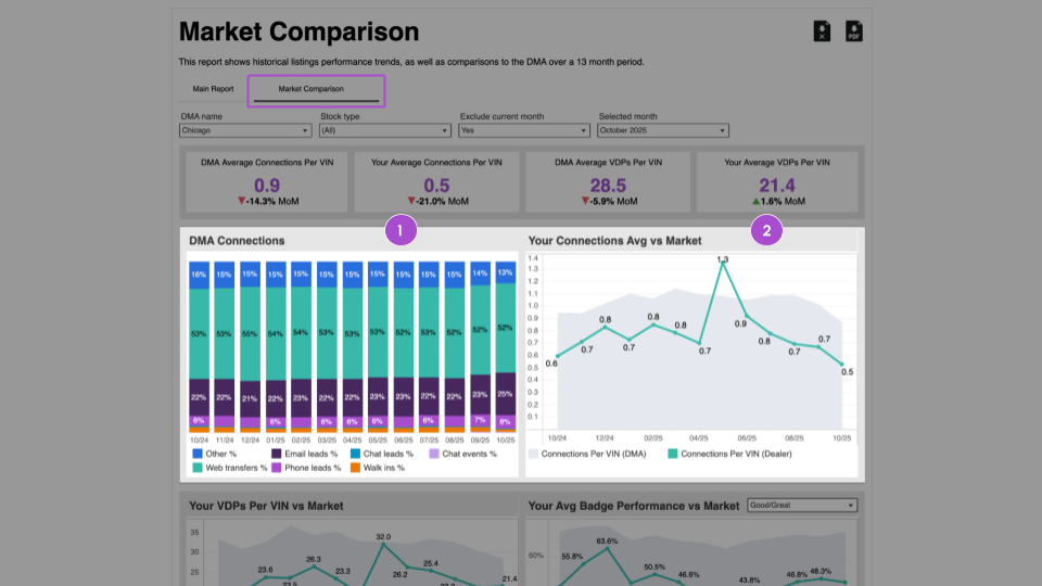
Scroll down to see the DMA Connections and Connections Average vs. Market graphs.
- DMA Connections: Connection volume by category for the entire DMA
- Your Connections Avg vs Market:
- Grey area: DMA trend for connections per VIN
- Line graph: Your dealership’s connections per VI
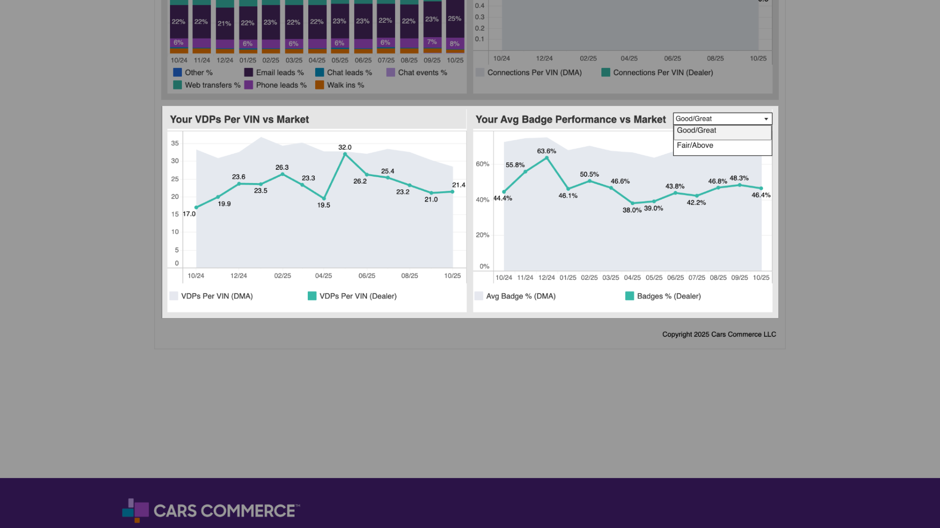
Scroll further to view VDPs Per VIN vs Market and Average Badge Performance vs Market:
- VDPs Per VIN vs Market:
- Grey area: DMA trend for VDPs per VIN
- Line graph: Your dealership’s VDPs per VIN
- Grey area: DMA trend for VDPs per VIN
- Your Avg Badge Performance vs Market:
- Compares your share of Fair/Above or Good/Great price badges against the DMA average.
- Use the filter to switch between Good/Great and Fair/Above badge views.
- Compares your share of Fair/Above or Good/Great price badges against the DMA average.
Group and major account views
At the group or major account level, the Performance Trends report allows you to compare:
- Multiple stores within the same group
- Group performance against the DMA
- Individual stores against one another
This enables cross-store benchmarking using the same metrics and timeframes.